Shop
DreamUp AI Art
DreamUp
Join
Log In
User Menu
Upgrade to Core
Theme
Display Mature Content
Suppress AI Content
Get Help and Send Feedback
Terms of Service
Privacy Policy
Submit
Deviation
Submit your art
Upload your creations for people to see, favourite, and share.
DreamUp
Turn your dreams into reality
Generate your own AI work.
Status Update
Post an update
Tell the community what’s on your mind.
Journal
Post a journal
Share your thoughts, experiences, and stories behind the art.
Literature
Submit your writing
Upload stories, poems, character descriptions & more.
Subscription
Get your fans' support
Fund your creativity by creating subscription tiers.
This deviation has been labeled as containing themes not suitable for all deviants.
Log in to view
Deviation Actions
Add to Favourites
Comment
3
Favourites
Make the first offer!
queen.bee3 Envision female figure eyes closed psyc
queenbeeme33
Best Offer
or $25
Buy Exclusive
More by
begemott
Watch
begemott on DeviantArt
https://www.deviantart.com/begemott/art/grief-299211947
begemott
begemott on DeviantArt
https://www.deviantart.com/begemott/art/the-jar-151026093
begemott
begemott on DeviantArt
https://www.deviantart.com/begemott/art/safe-48026855
begemott
begemott on DeviantArt
https://www.deviantart.com/begemott/art/the-memory-remains-52069338
begemott
begemott on DeviantArt
https://www.deviantart.com/begemott/art/On-Sundays-294915433
begemott
begemott on DeviantArt
https://www.deviantart.com/begemott/art/wish-43830860
begemott
begemott on DeviantArt
https://www.deviantart.com/begemott/art/broken-messenger-56777156
begemott
begemott on DeviantArt
https://www.deviantart.com/begemott/art/going-home-95188993
begemott
begemott on DeviantArt
https://www.deviantart.com/begemott/art/fireworks-335750977
begemott
Suggested Deviants
Crshie
Watch
Crshie on DeviantArt
https://www.deviantart.com/crshie/art/Untitled-1003029026
Crshie
Crshie on DeviantArt
http://creativecommons.org/licenses/by-nc-sa/3.0/
Crshie on DeviantArt
http://creativecommons.org/licenses/by-nc-sa/3.0/
ZaylorNoon
Watch
ZaylorNoon on DeviantArt
https://www.deviantart.com/zaylornoon/art/Why-Are-My-Toes-So-Weird-1014192740
ZaylorNoon
ZaylorNoon on DeviantArt
ZaylorNoon on DeviantArt
MetshaCollective
Watch
MetshaCollective on DeviantArt
MetshaCollective on DeviantArt
MetshaCollective on DeviantArt
Suggested Collections
circus
ChrisOstrowski on DeviantArt
https://www.deviantart.com/chrisostrowski/art/Carnival-264523612
ChrisOstrowski
yuumei on DeviantArt
https://www.deviantart.com/yuumei/art/Don-t-Forget-Me-351825541
yuumei
borda on DeviantArt
https://www.deviantart.com/borda/art/I-m-Here-to-Entertain-You-336977717
borda
Contemporary Surrealism
Viergacht on DeviantArt
https://www.deviantart.com/viergacht/art/Jhelane-463188446
Viergacht
AquaSixio on DeviantArt
https://www.deviantart.com/aquasixio/art/A-painting-as-a-door-465791028
AquaSixio
Waldemar-Kazak on DeviantArt
https://www.deviantart.com/waldemar-kazak/art/We-are-the-robots-416443956
Waldemar-Kazak
Abstract and surreal
imagist on DeviantArt
https://www.deviantart.com/imagist/art/flow-oil-377491695
imagist
AquaSixio on DeviantArt
https://www.deviantart.com/aquasixio/art/Sweet-Vertigo-498266225
AquaSixio
Artgerm on DeviantArt
https://www.deviantart.com/artgerm/art/Vision-342146584
Artgerm
You Might Like…
AquaSixio on DeviantArt
https://www.deviantart.com/aquasixio/art/When-she-was-six-277621394
AquaSixio
AI-Postcards on DeviantArt
http://creativecommons.org/licenses/by-nc/3.0/
AvengerB6 on DeviantArt
http://creativecommons.org/licenses/by/3.0/
ARCLYT on DeviantArt
davidcobos on DeviantArt
https://www.deviantart.com/davidcobos/art/Magic-room-442703542
davidcobos
JazeBaqti on DeviantArt
https://www.deviantart.com/jazebaqti/art/Untitled-1010503248
JazeBaqti
Miles-Johnston on DeviantArt
https://www.deviantart.com/miles-johnston/art/Substitution-312546128
Miles-Johnston
Mathurin156 on DeviantArt
https://www.deviantart.com/mathurin156/art/Zombie-180566053
Mathurin156
Michael-C-Hayes on DeviantArt
https://www.deviantart.com/michael-c-hayes/art/The-Dark-Night-of-the-Soul-589534038
Michael-C-Hayes
Featured in Groups
See All
love-new-artists
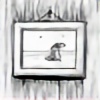
the jar - 2
By
begemott
Watch
Published:
Jun 23, 2012
312
Favourites
31
Comments
15.5K
Views
Description
Second attempt on this one:
[link]
It was good practice, but I somehow prefer the first version more.
Image size
900x689px 352.19 KB
Mature
© 2012 - 2024
begemott
Comments
31
Join the community
to add your comment. Already a deviant?
Log In
BillyNikoll
Oct 26, 2015
So beautiful work!
Reply
Load more